4 Years
Of da'wah and counting
Reverts · The Live Site
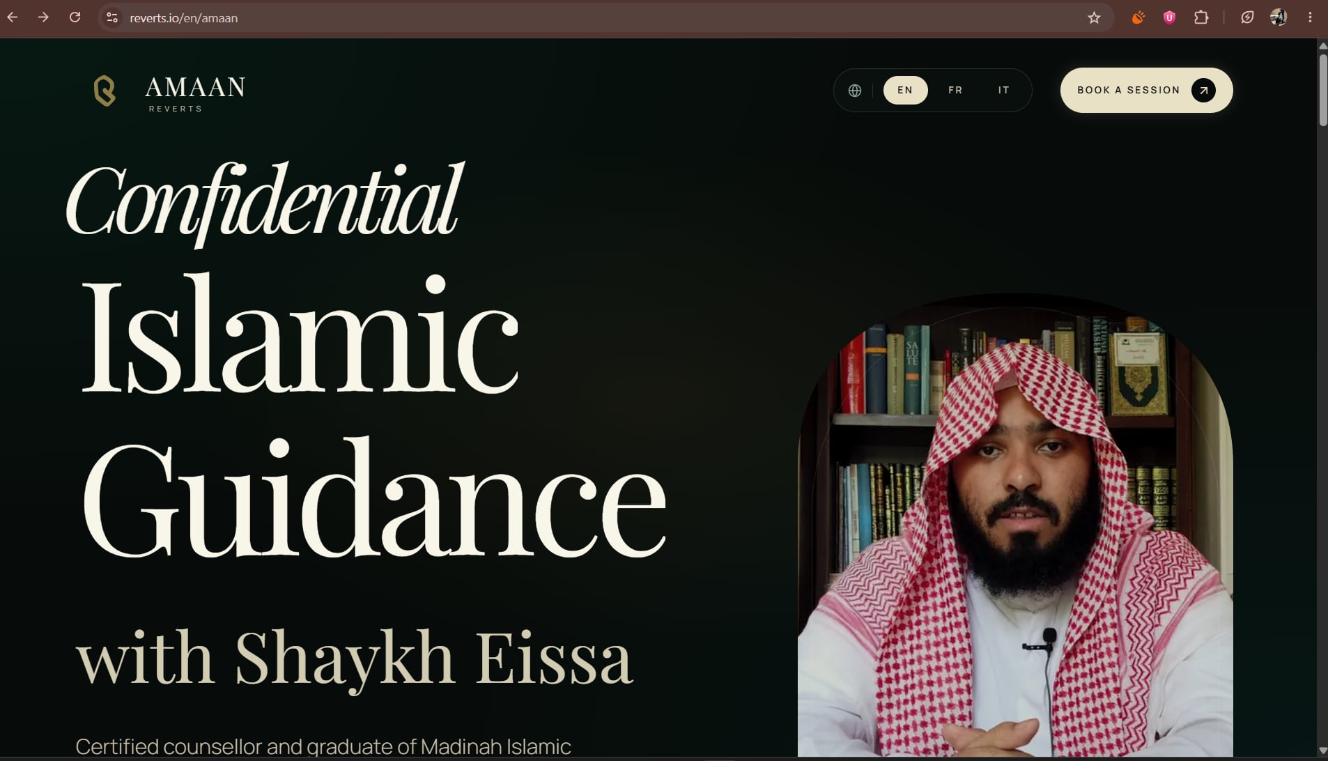
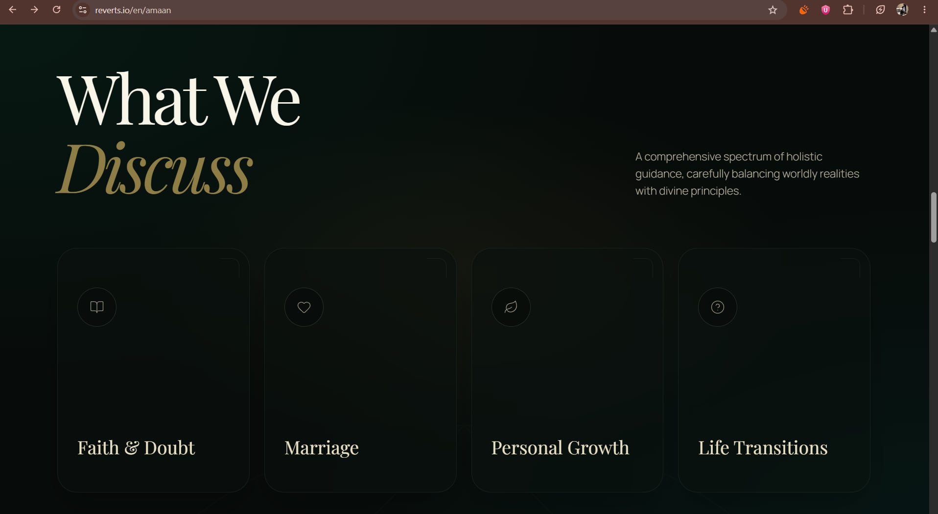
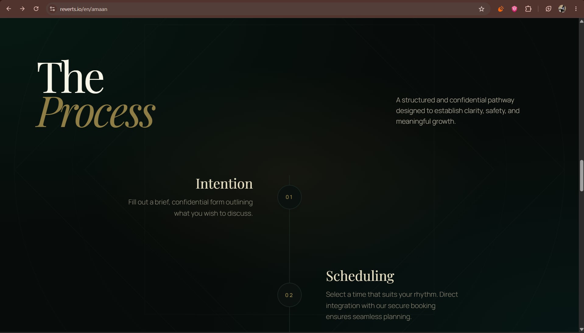
Hover to browse the live site
Reverts.io · Scene 03
An established online community for Muslims, reverts and people interested in Islam, given the identity, digital experience and support system to grow with it.
Brand Strategy · Rebranding · Digital · Community · CRM / Support System
Scene 03
The Achievement
An already-thriving, multi-thousand-member community given an identity, a digital front door, and an operational backbone built to match its actual scale.
What the rebrand actually was
A new logo→a foundation to grow on
Brand on the front. System on the back. The community in the middle.
The Build Order
in the order it had to be built
Three passes, torn off in the order they had to happen. Identity first, because nothing else could be designed without it; the front door before the back office; the system last, once the first two were real.
Built first
Identity · Colour · Patterns
Built second
Website · Mobile · Community experience
Built last
Support · Users · Activity · Resources
The Work
one layer at a time, bottom up
Three layers, built in order. Open one at a time.
Masjid, Circle and Path: faith and community, connection and belonging, one individual's journey. Together they fold into a single Reverts mark, with a flexible system of colour, type, pattern and 3D around it.
Masjid
Faith and community.
Circle
Connection and belonging.
Path
One person's journey.
Colour tested three ways: Warmth & inclusivity · Optimism & safety · Clarity & trust
Before
After

Scene 03
Where It Landed
a community at real scale
One mark, not three metaphors
Masjid, Circle and Path fold into a single Reverts mark: three linked ideas that hold together, not three symbols bolted on afterward.
A working back office
The rebrand carried past the visual layer into a support system (Users, Campaigns, Recordings, Support) that the team actually runs on.
A front door at scale
A globally distributed community got a digital entrance consistent enough to represent it accurately at its current size.
4 Years
Of da'wah and counting
4,400+
Islam-related queries answered
780+
Reverts from around the world
12,500+
Requests to join
~30 + 4
Volunteers + full-time staff
180+
Embraced Islam through the community
A clearer brand. A steadier digital presence. A stronger visual language. A support experience with structure.
The goal was never a new look. It was a foundation strong enough to carry a community already growing at this scale.
Community figures from the April 2026 reporting snapshot; members span Europe, North America, Asia, Africa and Oceania.
Scene 03
Cut to
the next scene
Positioning · Launch Communication · Creative Direction